

[Video] Masterclass: The power of data visualisation for data storytelling with Paul Vaartjes
Data visualisation, or the visual representation of data, is an extremely powerful tool for communicating information and insights from data sets into a clear and compelling story.
Research at 3M Corporation concluded that as humans, our brains process visuals 60,000 times faster than text. Visuals provide a shortcut straight to the brain, which is why high-quality infographics are 30 times more likely to be read by an audience than plain text.
Lead by Paul Vaartjes, Research Specialist in Strategic Insights at not-for-profit organisation, Compassion Australia, RMIT Online’s first masterclass of 2023 focuses on the power of visualisation for data storytelling. Paul takes you through:
- Getting the story wrong: what can happen when you don’t visualise
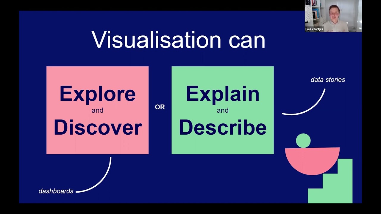
- Using the science of visual perception to communicate
- Data storytelling toolset: how to use data visualisation charts, flow, colour, titles, annotations and more to visualise your data
- Case studies that show why data visualisation is important and how it has evolved over time
- How you can get started with storytelling through the visual representation of data
Whether you’re working on a presentation or a research report, the fastest way of telling a story with data is to visualise it.
Learn more data visualisation in data science
Gain a deeper knowledge of data science and visualisation by studying RMIT Online's Graduate Certificate in Data Science.
Throughout the program, you’ll learn how to:
- Expand your knowledge of data and how it can be leveraged across sectors and industries
- Apply a breadth of technical skills, including programming, analytics, data wrangling and data visualisation
Call a Student Success Advisor today at 1300 701 171 to learn more.